
Dogs Trust
Design Sprint

Duration
4 Days

Tools
Figma, Adobe Photoshop

My Role
UX / UI Design, Web Design
What is Dogs Trust?
Sprint Overview

Double Diamond
Day 1

Pros
UI
UI has a consistant design system.
Branding
The message comes across strong and is visually appealing.
Cons
Navigation
Navigation bar is only accessible on certain devices
Donations
Donations are limited and appear confusing e.g. 3 ways to donate - no straight route.
Volunteering
Volunteering jobs are only accessible by the footer.
Assumptions

Goal
Users to experience a smoother donations process.

Questions
Can we make it easily accessible?
How can we shorten the process?
Donation Flow
Competitors

RSPCA
RSPCA is a top competitor with dog's trust. The website is user-friendly, responsive one all devices and has a clear navigation bar to make it easier for visitors to find information, donate, or engage with the organisation.
Cancer Research
Cancer Research is one the most recognised non-profitable organisations. The branding focuses on building a community. The user experience is effortless and intuitive, users can donate and access information on the company easily.
Interviews

Interviewees expressed a mistrust for Non Profit “Ubiquity”.
Users said they know very little about Dogs Trust.
People want to know where their donation goes to
2 interviewees are non-profit employees.
Non Profit employees interviewees insisted that transparency is crucial for people to be comfortable making donations and for the organisations reputation
Only one interviewee uses Dog's Trust.
Users also expressed that the cause must be compelling, and you must find people who connect with your cause so they are likely to donate
Affinity Mapping

Pain Points
“How do we know if organisations are telling the truth”.
“Don’t tell people openly about donating in case they have differing opinions”.
“I’ve not heard much about Dogs Trust, I’ve mainly heard about RSCPA”.

Motivations
"Feeling like you are making a difference is something we could all use."
Imperative to be transparent with how funds have been raised and spent.
Being emotionally invested in the cause
The cause must compel people

Behaviours
Assumes non profit organisation pay staff and genuinely don’t make profit for themselves.
Donates to cause which can be personally related to.
Generally doesn’t donate due to financial implications.
"feels good to donate especially when you care and are passionate about the cause"
Themes
Transparency and Engagement
Awareness and Personal Connection
Emotional Connection and Impact
How Might We
enable transparency whilst creating a smoother donation process, so users feel emotionally connected to the cause and are guaranteed that their contribution is making a positive impact?
Day 2
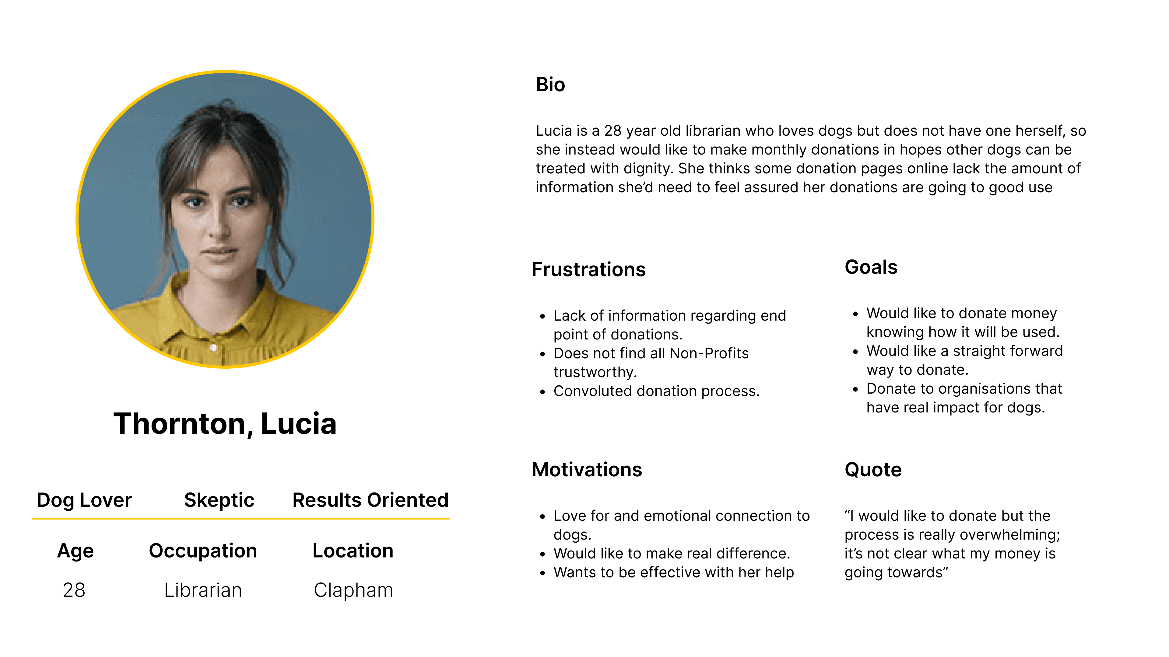
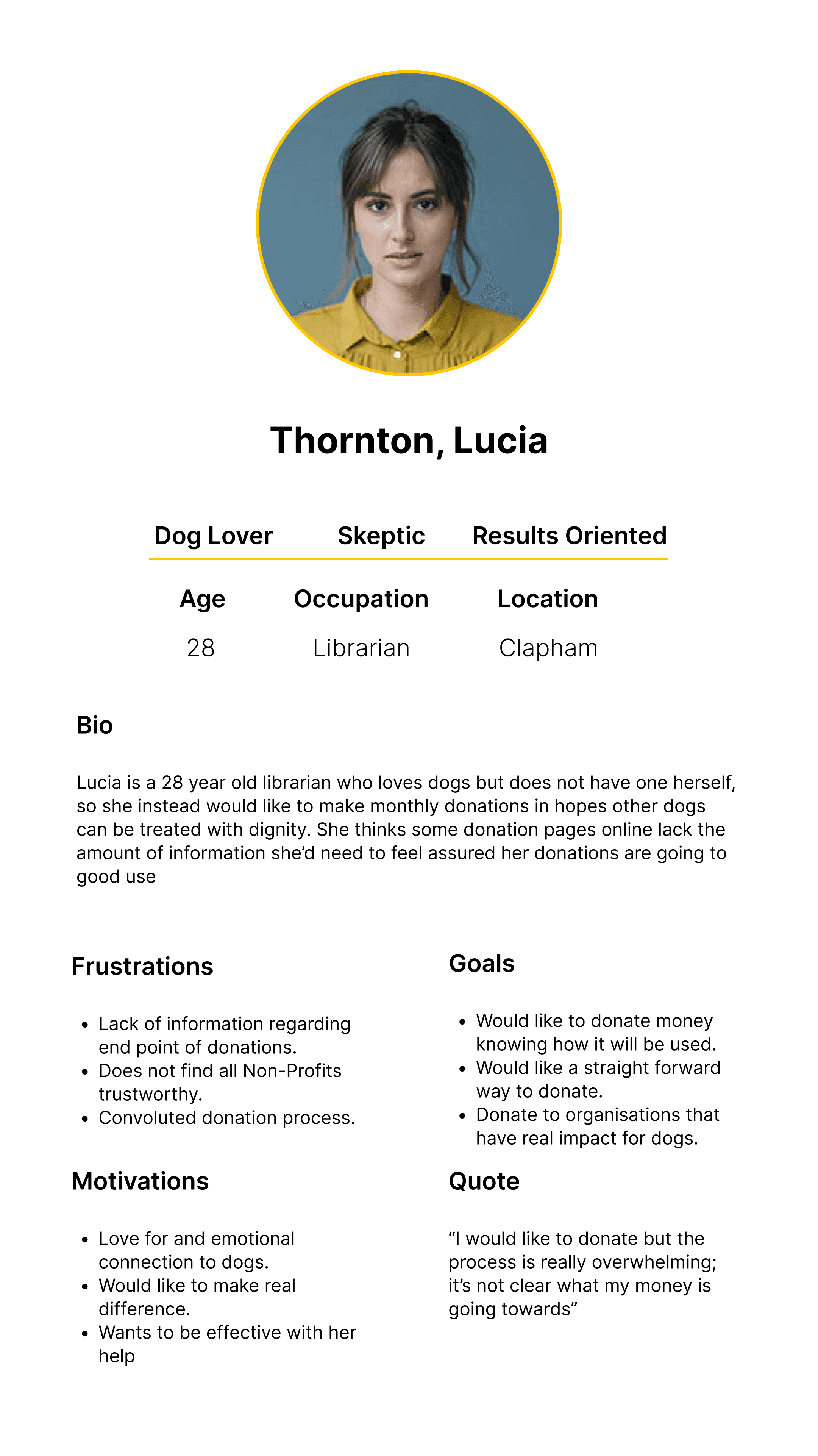
Proto Persona
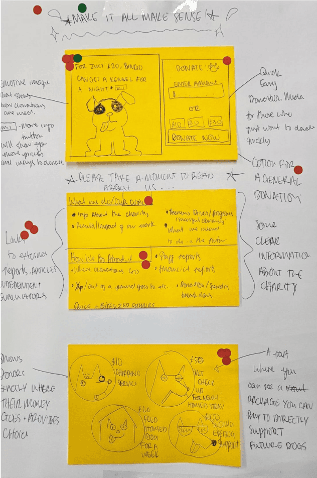
Sketches
Rationale


Day 3
Usability Test
Pros
No difficulties with home page or confirmation page
The cause of the organisation was clearly displayed with resources for reference
Cons
Layout of donation page counter-intuitive
Assuming to immediately donate instead of adding gifts
Consistent feedback about confusion using donation page
Day 4
Revising the initial prototype in response to our user testing feedback. Creating a design prioritisation matrix to rate the time and difficulty of amending tasks users struggled to complete. Through this methodology, we were able to make the necessary changes within our restricted time frame.
Revised Prototype
Key Learnings
Thanks for viewing


